Collaboration is the job.
The single biggest part of managing any project is communication. Making sure the right people know the right things at the right time and that nobody has to chase you for a status update.
Leadership should walk into a review and understand where things stand in about 30 seconds. That's what dashboards are for. A well-designed dashboard replaces a dozen status meetings and a hundred Slack messages. When everybody sees the same picture, everybody's rowing toward the same shore.
As a Product Manager, I use AI daily.. It's how I move faster on the parts of my job that used to take hours and now take minutes, so I can spend more time on the parts that actually need me: the decisions, the tradeoffs, the conversations, the judgment calls. The work where my experience moves the business forward. AI is just the newest collaborator.
Harbor is a release coordination dashboard mockup for cross-functional programs.
The model: each team ships work through whatever project management tool they already use. Jira, Linear, GitHub Projects, Asana, etc. Harbor pulls state from each team's source of truth and aggregates it into a single leadership-facing view. Updates run off Claude CLI automations triggered on repo activity, so status is live rather than manually reported.
It sits outside standard PM tooling on purpose. Access-controlled URL, zero onboarding cost for stakeholders. If you can open a link, you can review a release.
The Information Architecture maps to what actually keeps a program aligned:
- Release readiness score at the top so leadership can answer "is this shipping" without reading anything else
- Milestones timeline so dates are shared across all workstreams
- Convergence view showing every workstream tracking toward the release, with statuses
- DRIs with contact information so escalation paths are one click away
- PRD coverage with per-requirement ticket counts, surfacing scope-to-execution gaps in real time
- Build and Quality kanbans as sibling sections because QA operates on a decoupled cadence and needs its own board
- Blockers logbook so nothing quietly derails us
- Provisions for the reference material (PRD, design system, staging, retro notes, ceremonies), so stakeholder onboarding is a link click, not a meeting
- On Deck for PM-vetted product opportunities ready for leadership visibility

This is how I keep you in the loop

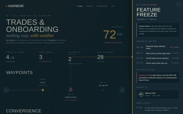
Milestone drilldown.
Clicking a waypoint on the timeline opens the sidecar with the tickets scoped to that milestone, dependency chain, escalation contact, and recent activity on tied tickets.
The timeline zooms 2x and auto-scrolls to center the selected milestone, while a connector line preserves the visual link between the sidecar detail and the moment on the timeline it belongs to.
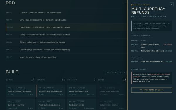
PRD coverage.
Every requirement in the Product Requirements Document ties to the tickets covering it, grouped by workstream.
Status shows explicit ticket counts (2/3 covered, 0/1 covered) so partial and missing coverage are immediately visible.
Clicking a requirement opens the sidecar with the linked tickets, an explicit callout for any gap between what was scoped and what's on a workstream, and a filter action to reduce the kanbans to that requirement's ticket cohort.
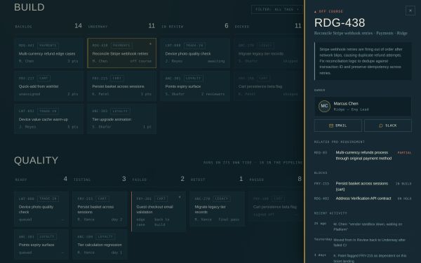
Ticket detail.
Clicking a ticket opens the sidecar with description, owner contact information, the requirement the ticket rolls up to, dependent tickets, and recent activity.
Every ticket knows what it's shipping for and what it's blocking.
DRI detail.
Clicking a crew card opens the owner's active work: assigned tickets with due dates, active alerts, recent activity, and quick actions to email, Slack, or filter the dashboard to their surface area.
Amber avatar rings flag whoever's stream currently needs escalation, so leadership can spot where attention is required at a glance.

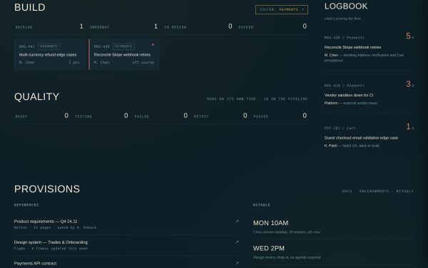
Tag filtering.
A dropdown in the Build header filters the kanbans by tag. Clicking any tag on any card applies the filter directly. Column counts update as tickets are hidden, so the board reduces to just what's relevant to the current conversation.
On Deck.
PM-vetted product opportunities surfaced for leadership review. Each card shows source (retro, CX, data, eng), effort estimate, and impact hypothesis.
Clicking a card opens the sidecar with rationale, why now, related in-flight work, and contact information for requestor or PM and an upvote or downvote prioritization signal.