
• Home
  • Product Management
  • Design
  • Studio
  • About
  • More
    • Home
    • Product Management
    • Design
    • Studio
    • About
  • Home
  • Product Management
  • Design
  • Studio
  • About

Design

UX Research | GoDaddy AiroWeb Design | OWC Digital

UX Research | GoDaddy Airo

As you might imagine, I can't share any of my real work from my tech jobs - so GoDaddy Website Builder, GoDaddy Airo, is the focus of this User Experience study.


Disclaimer: GoDaddy didn't ask for this.

An Illustration of the Problem Statement

Video of the Delete Group function User Experience related to the Problem statement

When using the Website editor panel, I click delete instead of the save button due to the button placement, and don't receive a delete confirmation alert and can't undo the action. 


I've listed a few of the users friction points related to the Delete Group button below:

  • Delete button appears in same area as "accept" in other common editing tools
  • No confirmation dialog when delete is clicked, No "Are you sure?" confirmation dialog
  • Lack of recycle bin or temporary storage, No automatic backup before deletion, and no way to recover recently deleted items
  • No visual indication of what will be deleted. 
  • Easy to accidentally select and delete parent containers.
  • Poor feedback on deletion progress


I noticed sometime between the study and 2026, GoDaddy Airo added an undo function!.

What are other users saying?

User feedback was collected from 7,300 verified sources between January and December 2024, comprising 3,200 user reviews from marketplace and third-party review sites, 2,100 authenticated forum posts across web development communities, 1,400 social media interactions on major platforms, and 600 responses from a public GoDaddy user survey.


Lost content without warning

"I was trying to edit my homepage and accidentally deleted the entire services section. There wasn't even a warning! Two hours of work gone in a second." 

- Small Business Owner

"Had to rebuild my entire about page from scratch because of an accidental deletion. Three hours of work down the drain." 

- Professional Services

"Lost a week's worth of updates because of misplaced delete buttons. No warning, no confirmation, just gone." 

- Real Estate Agent


Unfortunate miss-clicks

"Every time I try to resize an image, I end up hitting the delete button that pops up. It's placed in the worst possible spot." 

- Blog Owner

"The delete button is impossible to avoid on mobile. The touch targets are too close together." 

- Mobile User

"The delete button is right next to the edit button. One misclick and my whole navigation menu disappeared. This is absolutely frustrating." 

- Freelance Designer


Customer support interactions

"Called support immediately after accidentally deleting my product catalog. Was on hold for 20 minutes, then told there's no recovery option. Lost 3 hours of work." 

- E-commerce Owner

"Spent 45 minutes with customer support trying to recover deleted content. They told me there's no way to get it back. How is this acceptable?" 

- Nonprofit Manager

"Called three times hoping to get someone who could help recover my deleted content. Each time got the same answer - nothing can be done." 

- Restaurant Owner

"Spent 45 minutes in chat support trying to recover my deleted homepage section. The agent was nice but kept saying there's no way to get it back. Why don't they have a recovery system?" 

- Business Owner

"The chat agent suggested I should have made a backup before editing. How was I supposed to know I needed to backup before every small change?" 

- Blogger


Issue metrics

Across 7,300 verified experiences, the same friction points kept surfacing. The numbers below break down what I found. Users flagged pain points across every corner of the editor, from template customization to mobile responsiveness. But one category kept surfacing more than any other....the pesky delete function.

Delete button' issues account for 22% of UI complaints

Between January and December 2024, I pulled together 7,300 user-reported experiences from the GoDaddy support communities and marketplace reviews. Delete button issues showed up in 22% of them. which includes accidental section deletions, content element deletions, navigation menu loss, and media deletion. It's the most disruptive single UI issue in the dataset.


Fixing it wouldn't just clean up the editor experience. It would cut down support tickets, rebuild user confidence, and free the development team to focus on the harder stuff.

Each incident costs 3 hours, mostly on the customer's clock

Every accidental delete takes about 3 hours to fully resolve. Only 75 minutes of that is GoDaddy's, split across a 45-minute initial support call and a 30-minute escalation. The remaining 2 hours is unpaid time the customer spends rebuilding whatever they lost.


Volume is trending up too: from 2,400 tickets a year to 3,200, a 33% increase over 12 months, with bigger spikes during high-traffic months.

GoDaddy spends ~$487,440 a year on a preventable problem

Direct support for delete-related issues costs GoDaddy roughly $487,440 annually, or about $203 per incident. That breaks down across three real cost centers: 

  • $282,440 in direct support labor
  • $85,000 in infrastructure and training
  • $120,000 in overhead.


GoDaddy offers no compensation for content lost to this issue. No refunds, no recovery, no version history to restore from. 


That cost gets externalized onto the customer as unpaid rebuild time and reputational damage, and it shows up later as churn and negative reviews rather than as a line item.

Suggested action
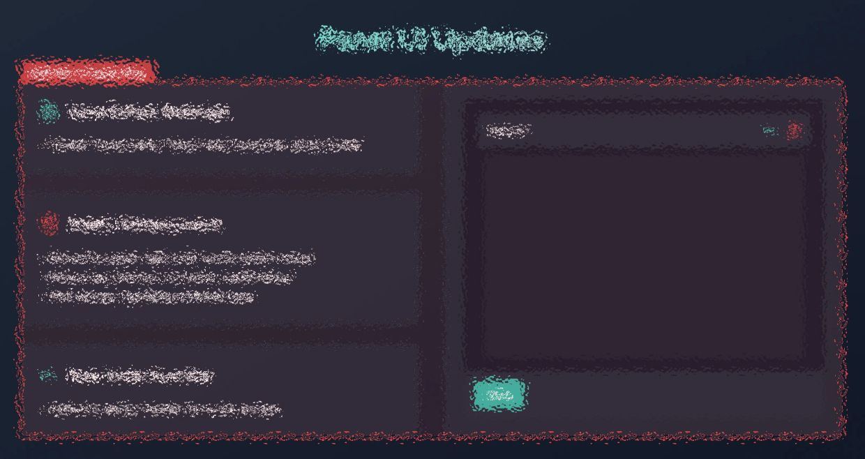
Update the Panel UI.

If requested, at my discretion, a detailed 14-week update plan is available.


Update plan includes:

  • Mockups of recommended design updates using the current systems UI components and transitions.
  • A 14-week project plan with strategic phase timing through research and design to development, testing and deployment.
  • Business KPIs and user success metrics.
  • Future enhancement to delight customers.

In Case You Were Wondering...

I've spent my career doing UX research at large e-commerce companies. 

Brand overhauls, website updates, app innovations, new product development. B2C and B2B. I've been the person who figures out where users hit friction, and I have a track record of turning that research into project plans that ship measurable wins for both the user and the business.


This case study turns that lens on a product I used to build the current version of this portfolio site, and I hit enough friction along the way to have opinions. Here's what I found, and what I'd change.


I've coded plenty of websites and I regret nothing about picking GoDaddy Airo to quickly build this one.

Copyright © 2026 AprilDoesDesign - All Rights Reserved.


Powered by

This website uses cookies.

We use cookies to analyze website traffic and optimize your website experience. By accepting our use of cookies, your data will be aggregated with all other user data.

DeclineAccept