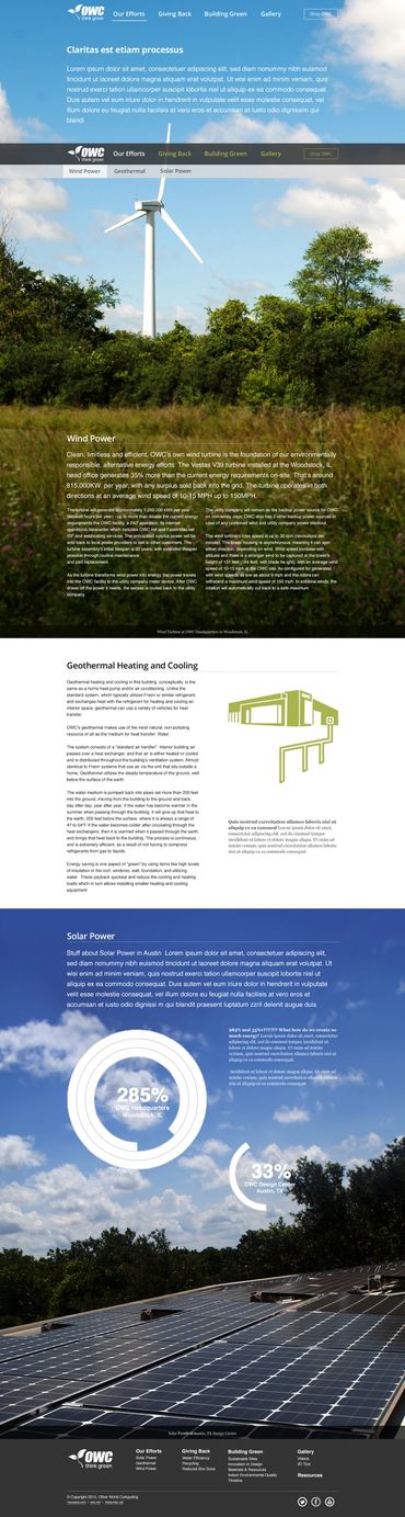
• Home
  • UX Research
  • Web Design
  • Illustration
  • Printmaking
  • More
    • Home
    • UX Research
    • Web Design
    • Illustration
    • Printmaking
  • Home
  • UX Research
  • Web Design
  • Illustration
  • Printmaking

Web Design

I build bridges between people and technology.

Think Green @ OWCOWC DigitalTenders and Trails

Think Green @ OWC

Logo Design, UX/UI & Frontend Development of an environmental impact and LEED achievements showcase website.

Think Green microsite

The Think Green microsite showcases OWC's commitment to environmental stewardship and LEED achievements with an Apple-inspired design approach. Along with creating the Think Green logo and website, I partnered closely with our lead developer to ensure decisions prioritized accessibility and long-term sustainability.


The website features a sticky header for seamless navigation, and consistent content structure throughout Drawing inspiration from Apple's environmental site, I designed this area using impactful imagery, the custom Think Green logo, and typography to convey OWC's story of sustainability. 


When parallax scrolling was trending during development, I collaborated with our developer to advocate for a static background based on accessibility research and future-proof code maintenance considerations.


Throughout both design and development phases, I worked alongside our lead developer to emphasize creating maintainable graphics and code structures. Each page was carefully wire-framed and mocked up with accessibility in mind, ensuring the site would serve users effectively for years to come. My involvement in both design and development allowed me to make informed decisions that balanced visual impact with technical sustainability and universal access.


Logo options

During the Think Green logo design phase, I explored various ways to blend natural elements with OWC's established brand, from simple sprouts to wind turbines, and growing trees. 


I kept the typography consistent across all versions, using a bold weight for "OWC" and a lighter treatment for "think green" underneath. The black color scheme ensures these logos work across different applications while the natural elements represent sustainability without compromising the clean, professional look OWC is known for.

Think Green webpage mockups
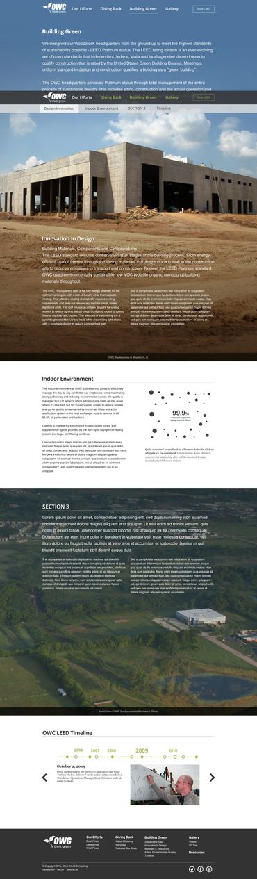
These website mockups demonstrate how I transformed the initial Think Green microsite wireframes into the final design. I implemented media queries and JavaScript to programmatically swap background images based on screen size - serving optimized images while maintaining high-impact visuals across devices.


The site flows through several key sections highlighting OWC's environmental initiatives. The design maintains visual consistency while effectively communicating complex environmental initiatives through a strategic mix of photography, illustrations, animations, and data visualizations. The technical implementation ensures the content and imagery adapt seamlessly without compromising the visual storytelling that drives the site's narrative.

OWC Digital

OWC Digital's products are some of the best you'll find. We created a landing page and digital ad campaign to show creative professionals how easily OWC products can enhance their daily workflow.

Digital Ad campaign

The "Connect Everything" campaign leverages a clean, tech-forward visual approach that emphasizes connectivity and seamless integration between OWC Digital products and various tools used by creatives. 


Using custom illustrations in a modern, minimal style, I showcased the USB-C Dock as the central hub, with strategic yellow and blue cable illustrations drawing the eye through the composition to demonstrate connectivity. 


This focused design approach proved highly effective - click-through rates grew over 300% during the six months I was responsible for creating OWC's digital ads.

This webpage design beautifully executes the "Connect Everything" strategy through a cohesive blend of product photography and illustration.

Design strategy

  • Blend high-end product photography with minimal, modern illustrations.
  • Create a consistent visual hierarchy where product photography serves as the hero element.
  • Use illustration elements to demonstrate connectivity and workflow possibilities.
  • Maintain OWC's signature blue color palette while incorporating dynamic accent colors.

Product Presentation

  • Each product (USB-C Dock, Mercury Elite Pro, Thunderbolt 2 Dock, ThunderBay 4, and Envoy Pro Mini) is showcased in context with the devices it connects to.
  • Consistent illustration style across all products, using the same minimal, tech-forward approach
  • Strategic use of OWC's signature blue as the primary brand color, with pops of yellow and red in the cable illustrations

Visual Hierarchy

  • Clean, vertical layout that gives each product its own space to breathe.
  • Left-to-right reading pattern alternating between product imagery and descriptive text.
  • "Learn More" and "Buy Now" CTAs consistently positioned for easy navigation.

Illustration Integration

  • Custom illustrations show real-world usage scenarios for each product
  • Connected devices (monitors, cameras, storage devices) are rendered in a modern, minimal style
  • Cable illustrations create visual flow and demonstrate connectivity options
  • Background elements use subtle gradients to add depth while maintaining clarity

This design successfully combines the technical precision needed for product photography with the storytelling potential of custom illustrations, creating a unified visual language that emphasizes OWC's role in connecting creative workflows.

Tenders & Trails

Tenders & Trails was a blog that reviewed all of the best snowboarding destinations and their chicken tenders.

Tenders & Trails mission

Tenders & Trails began as a well-followed New England photography blog looking to expand its horizons. I designed a fresh identity system and blog architecture that put the owner's exceptional photography front and center. The new design prioritized visual storytelling, allowing her stunning images to command attention while smoothly integrating her expanding blog subjects.

My design approach

Tenders & Trails was built to showcase the owner's professional photography, using their striking landscape and nature images as hero elements across all deliverables. I created a minimal, typography-driven logo, a neutral color palette and clear typography hierarchy that complemented the visual content. 


I delivered Business cards, aletterhead, and a flipbook that integrated landscape photography while maintaining clean, minimal design elements. The blog website featured a responsive layout that prioritized large-format images for an immersive viewing experience.


The system's strength came from letting the owner's professional photography take center stage - each image carefully selected to convey the beauty of New England's outdoor spaces. The clean, minimal design elements served to frame and enhance these photographs rather than compete with them, creating a cohesive brand experience that felt both sophisticated and authentic.

My work

Copyright © 2025 AprilDoesDesign - All Rights Reserved.


Powered by

This website uses cookies.

We use cookies to analyze website traffic and optimize your website experience. By accepting our use of cookies, your data will be aggregated with all other user data.

Accept